LAB Color Space
This page is currently growing 🌿 🚧
- This page contains animated PNGs
Have you heard of LAB color space? As a digital artist, I've seen it mentioned in random places or within the UI of the programs I use, but it kind of slid off my brain. I figured it was just a gamut (like CMYK for printing) or something, something that didn't apply to the kind of work I did.
My life's mission right now is to convince you that LAB and its derivatives are a huge deal for any artist who works digitally. It's not just a color picker, it's not solely relevant for some single obscure field of work. It is an entirely different dimension of color, and changes the way you can paint digitally and think about color.
Before I can properly demonstrate what the point of LAB is, I'll need to explain what a color space is, and what RGB is and what's wrong with it.
What's A Color Space?
A color space is a way to organize a group of colors in a way where you could put in some values and get a specific color out of it.
If you were taught about color mixing, you have a sort of simplified color space in your head. You were probably taught that the primary colors are red, yellow, and blue, and that you can mix primary colors to make any other color on the color wheel.
The color wheel in your head that you learned from school is a sort of color space. The inputs are red, yellow, and blue, and you can express other colors by assigning values to each of those inputs. If you mix red paint and blue paint, and no yellow paint, you'll get purple.
This is like the RGB color space*; you can specify a value for red, green, and blue, and describe a color that anyone else with an RGB display can reproduce.
* There are actually several "RGB color spaces" (sRGB, Adobe RGB, P3), but they all follow the same general description of the following generic RGB color model.
RGB
You can visualize an RGB color space as a three dimensional cube.
- The X-axis measures how Red a color is
- The Y-axis measures how Green a color is
- The Z-axis measures how Blue a color is


Every color a screen can display can be represented with RGB, since the pixels making up the screen each have a red, green, and blue sub-pixel that can have different values. You can represent an RGB color in a few different ways, such as hexadecimal (#FF00FF or #F0F), or as a tuple (255, 0, 255), (100%, 0%, 100%), (1.0, 0.0, 1.0). These all represent the same color, magenta, just with different scales for each color channel.
HSL
If you have ever used a drawing app, your canvas has probably been in RGB space. But, your color picker was probably HSL (hue/saturation/lightness) or HSV (hue/saturation/value), which is RGB warped into the shape of a cylinder instead of a cube.
- The Angle measures what Hue the color is
- The Depth measures how Saturated a color is
- The Height measures how Light a color is


LAB
LAB (also called CIELAB or L*a*b*) is a color space developed by CIE in 1976. The point of CIELAB is to be a way to measure colors in the real world, accurately describe differences between colors, and represent every possible color that is visible to humans.
CIELAB is meant to be a globally consistent standard for representing color. This is opposed to RGB, where the same color values will look different depending on the display you're using. Also, LAB covers the entire gamut of human vision, while RGB covers a relatively small portion.
It's important to keep in mind that LAB must be converted into RGB to display on your monitor, so it will be limited by the RGB gamut. So what's the point of using LAB digitally? If it's meant to describe color in the real world, and ends up being converted into RGB anyway, what's the point?
Well, since the LAB space is meant to be "perceptually uniform", it makes transitions between primary colors MUCH different than in RGB. I'll explain this in the LAB mixing section.


LAB contains 3 color channels:
- L* measures a color's Lightness
- a* measures how Green or Red a color is
- b* measures how Blue or Yellow a color is
The asterisks are used to differenciate LAB from an older color space called Hunter's Lab. They are included in the pronunciation, so when talking about a CIELAB color channel you would say "L star" etc.
LAB color space describes its channels differently than RGB or HSL. Lightness usually ranges from 0 to 100%, while a* and b* both go from -100% to +100%. Since a* measures green-red, when a* is -100% the color is very green, and when it's +100% it's very red. Same for b* with blue and yellow.
The color channels being green-red and blue-yellow is based on the opponent process theory of color vision. This theory has been challenged for its accuracy. However, even if it isn't biologically accurate, it still provides a good amount of primary colors for the color space.
Some applications might represent a LAB color as a decimal value rather than a percent. In Krita, which is the art program I use, every color channel (at an 8-bit color depth) is in the range 0-255, no matter what color space. This means that (50%, 0%, 0%) in a standard LAB implementation would actually be (128, 128, 128) in Krita.
Color Mixing (In RGB)
Mixing a color with another works by simply finding the difference between the two color values, dividing it by some factor, then adding the result back to the first color. The way this looks in 3D is by plotting a straight line from one color to the other. The different proportions of mixtures will be the colors along that line.
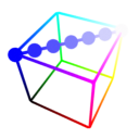
When drawing, if you use any kind of brush that isn't at 100% opacity, your canvas will be mixing colors like this. If you draw with pure blue on a white canvas, you'll get the colors on the line above (in RGB).
There are other ways your canvas can mix colors if you use Blend Modes. They change the math that is used to mix two colors. (insert link to the blend-mode page here when its done)
RGB Is Garbage, And Here's Why
While RGB is very efficient and fast for computers to handle, are many limitations. One of the more obvious limitations is the color gamut, but as a digital artist it is unavoidable. The color gamut is the range of colors that can be produced by a system. Unfortunately, computer monitors cannot reproduce the full range of color that humans can see.
However, since the point of this page is mainly about using color spaces for digital art, the limited gamut is an inevitability in any color space. Unless the technology for computer displays radically changes, the various RGB gamuts that displays use now are just what we have to deal with.
No, there are other problems with RGB, and they can be avoided. While the color gamut is a hardware limitation, there are other issues can be solved with software (using a different color space).
The main problem with RGB is how colors transition between each other. The way the color channels are physically layed out in the color space inherently leads to these problems. This is hard to explain, so I made a bunch of graphics to help illustrate the issues.
Looking at the image from the last section, you might notice that the blue+white mix looks more like lavender than a "light blue". Part of this is because cyan is interpreted as "light blue". There are similar looking deep blue pigments in real life that will produce sky-blue when mixed with white, so this light purple does not look natural. Even ultramarine blue pigments don't have this much of a purple quality when mixed with white.
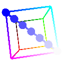
When shading a blue material, you'll often find yourself "bending the line" by manually adding cyan like this. Remember, a straight line represents how the colors on the end points would mix in RGB. A curved line represents a palette that an artist would have to assemble manually.
If you've read a lot of digital painting advice online, you might have heard "don't shade with black!" While there's nothing inherently wrong with doing this, it does produce much greyer tones than might be preferred.
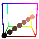
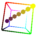
You don't even have to shade with black to get muddy colors, though. When working in RGB, I am always doing manual adjustments like this. Shading yellow with a warm purple is common, however mixing them directly makes the yellow look kind of sickly.
You might think "why not just curve the RGB space then, to make these curves straight?" or "why can't art programs just use code that doesn't mix colors linearly?". If you were actually thinking this then I'm literally squeeing and clapping. The latter is similar to what Mixbox does.
Mixbox is a huge improvement over standard linear RGB color mixing, and is a lot more intuitive than LAB in some key ways that I'll go into later.
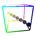
Another issue with RGB is that the only "black" exists where all color channels are 0, and the only "white" exists where all color channels are 100%. This makes the space "unbalanced"; there are significantly fewer near-black and near-white tones. You can visualize this by comparing the surface area of cross-sections of the RGB cube:
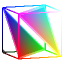
These cross-sections are animated to move from the black corner to the white corner. Each cross-section represents the set of colors that have the same distance from black. Notice that the closer a cross-section gets to black or white, the area of the cross-section gets smaller and smaller, until it becomes a single point.
So what? Well, for one thing this means there are fewer distinct colors near black/white that you can even display using standard RGB. You can visually notice this lack of colors in digital videos that are dark enough.
UNDER CONSTRUCTION!!!!!!
Back to top